LINC EDUCATION
Dashboard redesign for unit teachers
and university management
Online Educators
350+
Students
15000+
Role
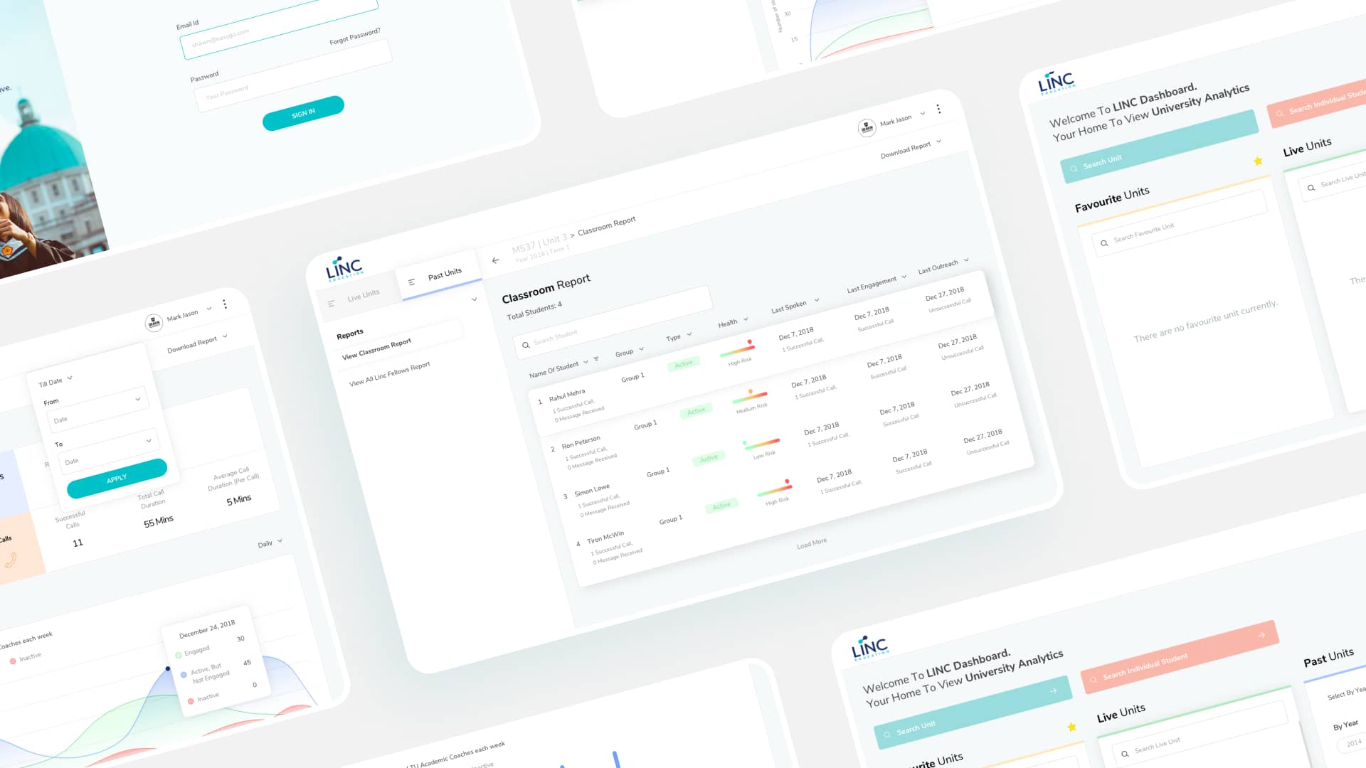
My responsibilities included secondary research, ideating concepts, wireframing, iterating on feedback and delivering final designs
Methods Used
Business Analysis, User Persona, Problem Statement, Sketching & Design Workshop, Prototyping & Iterating
Tools
Sketch, Zeplin
Problem
Linc Education’s existing platform was a weekly MIS shared with the management and unit teacher. It was a static view and only available at the unit level once a week. It lacked customization features and real-time data that users needed to evaluate event success and improve their future tasks. Both Linc Education and their users desired to custom choose the dates, go deeper into student reports.
Solution
An easy and robust dashboard for insightful decisions
With the help of the client's deep understanding of the problem, we created a platform that was insightful enough and customized to help unit teachers and management better understand how their units and students are performing. The final output was a robust, customizable, yet easy-to-understand dashboard.
Here’s what the new platform include:
Home Dashboard
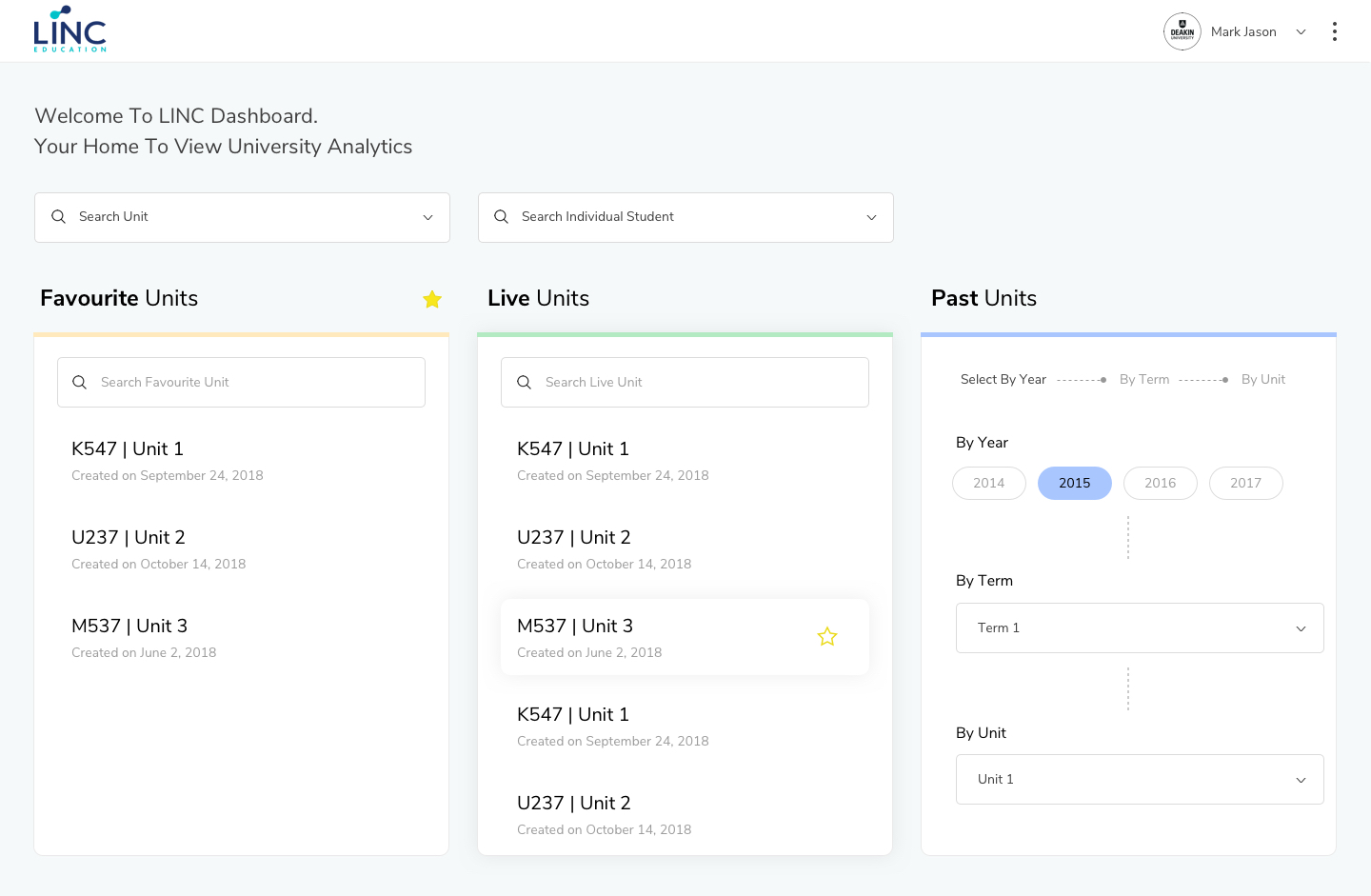
Linc Education's existing dashboard didn't have a home screen. Users could just view six engagement metrics and one performance metric. In order to provide users more flexibility, giving an overview of favorite units, live units, and the ability to select past units right on the home screen was the correct step. Users could quickly choose what actions they need to take without having to go through many steps.
Live / Past Unit Report
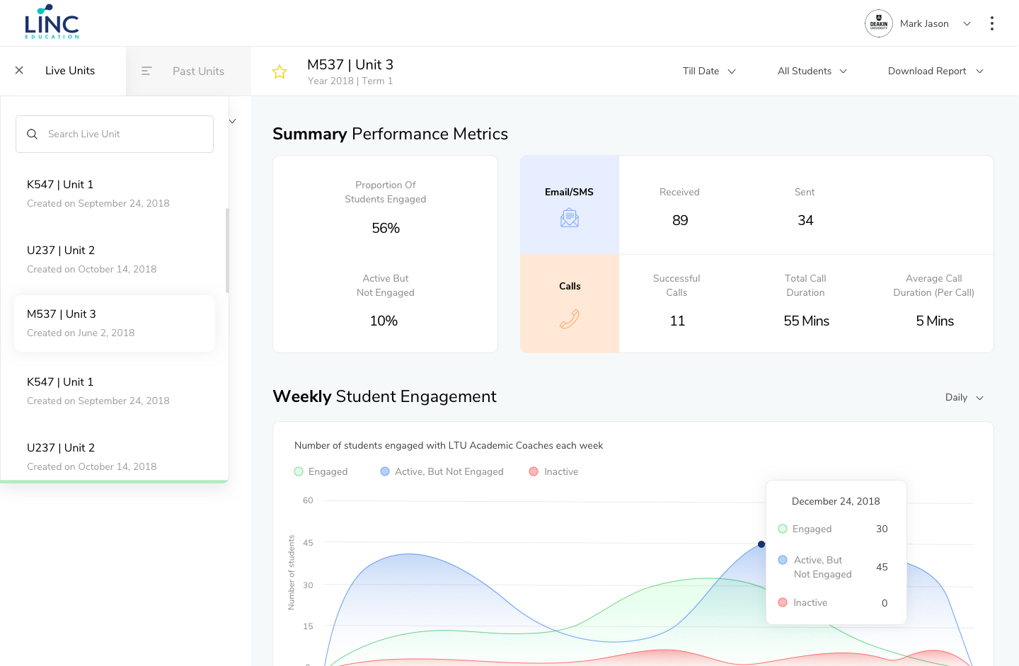
The new live/past unit report shows reports in a systematic and organized way. Users can view a summary of performance right on top followed by other engagement metrics like weekly student engagement, student issues, email/SMS engagement. Users could also sort the 'Till Date' or 'All Students' tab, where they can view different types of analytics for each of their individual students. The ability to download reports in different formats made users' tasks easy to share or engage with the management team separately.
Classroom Report
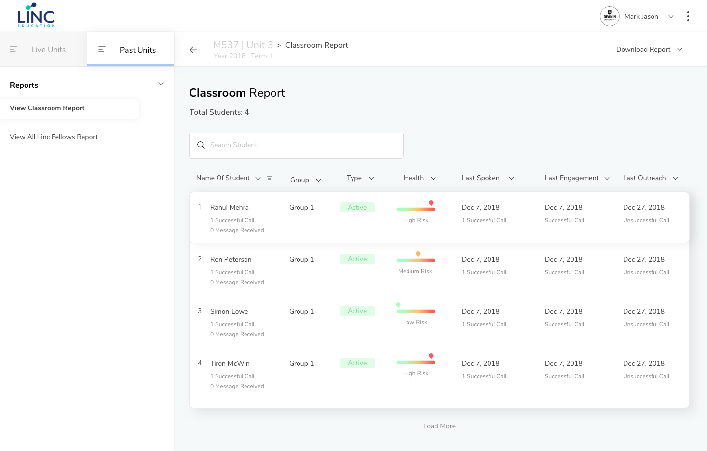
Classroom reports help users get the details of each student. It shows if a student was active in the engagements or no. It can be sorted by group, health, last engagement along with other useful parameters. Showing status with color range and markup helped users glance through it quickly.
Individual Student Report
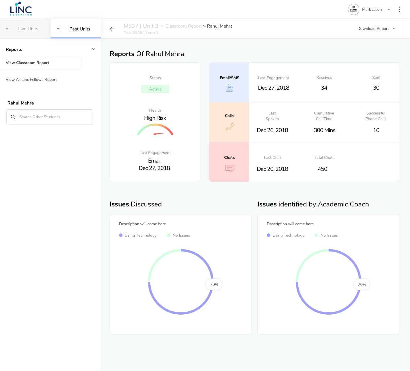
With individual student reports, unit teachers or management could easily track student's performance with engagement and matrics analytics. This way it is easy to identify if any particular student needs extra attention or need to solve any issue.
Research & Process
Even though I couldn’t conduct primary research due to the client's constraint, I was able to gather some insights with the help of the stakeholder's interview and questionnaire shared.
What do users want?
There are two users of this dashboard application.
Unit Teacher - Age > 35 years
University Management - Age > 30 years
Needs:
For Unit Teacher
1. Would like to review LINC’s engagement with students
on a real-time basis (how are students engaging and what are they talking about?)
2. Be able to track individual student-specific insights
For University Management
Get a view of the engagement in a similar manner as the unit teacher, but also be able to get a consolidated view across all units and compare between units as needed.
Early explorations and wireframes
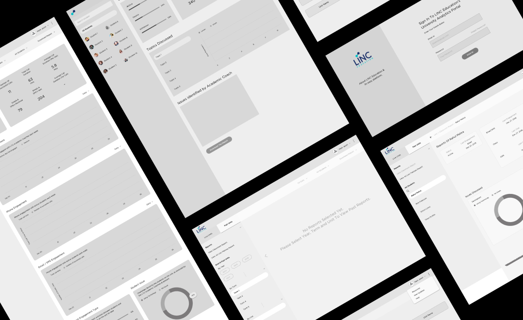
Based on what I learned from stakeholder interviews and secondary research, I started sketching and created wireframes. There was a total of 4 rounds of wireframes with corrections that made our overall structure final.
The high-level goals were to make the designs:
1. An easy interface that allows users to easily access data at different levels
2. Prompts repeat usage of the dashboard (i.e. users use it on a daily basis, instead of once a while/weekly)
Style Guide
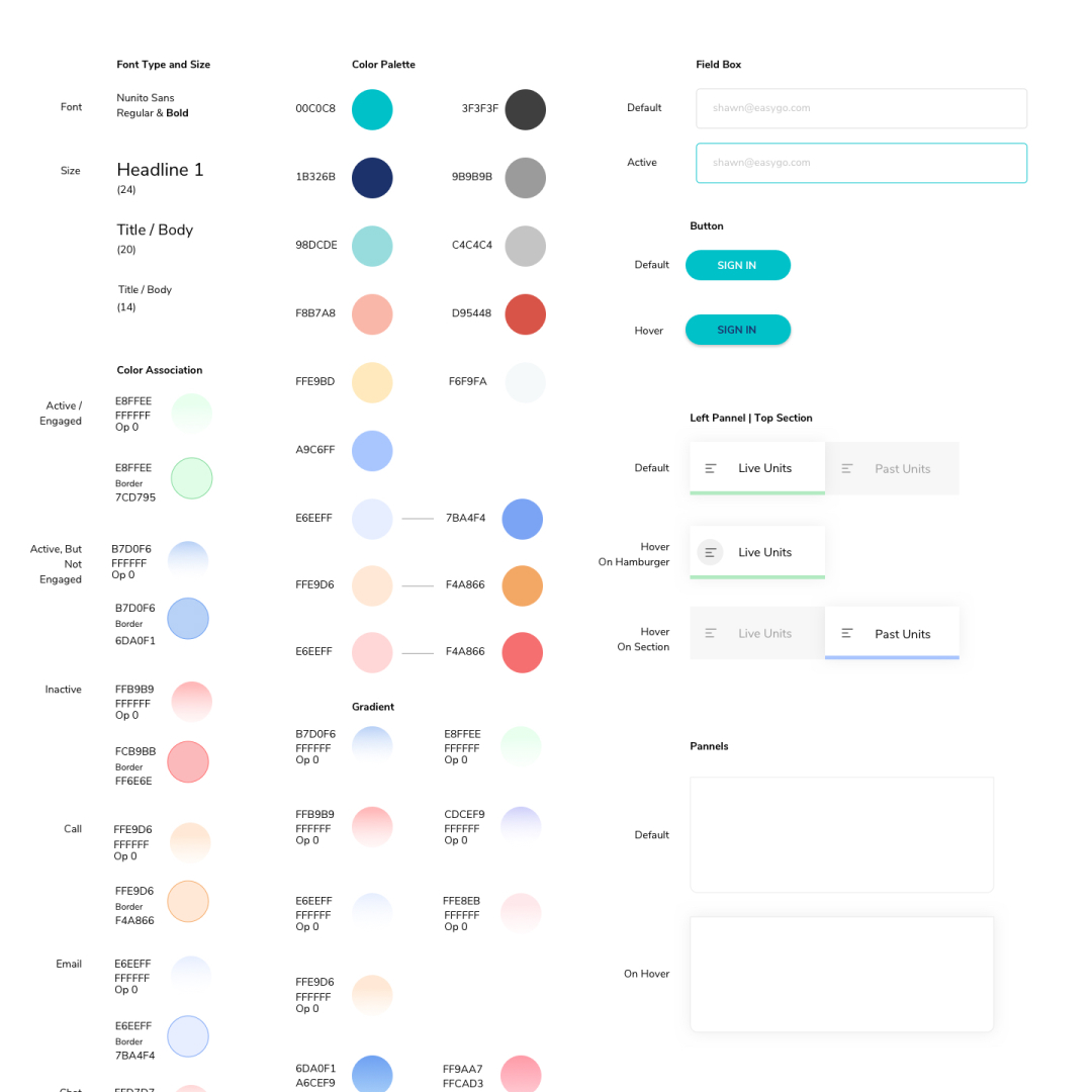
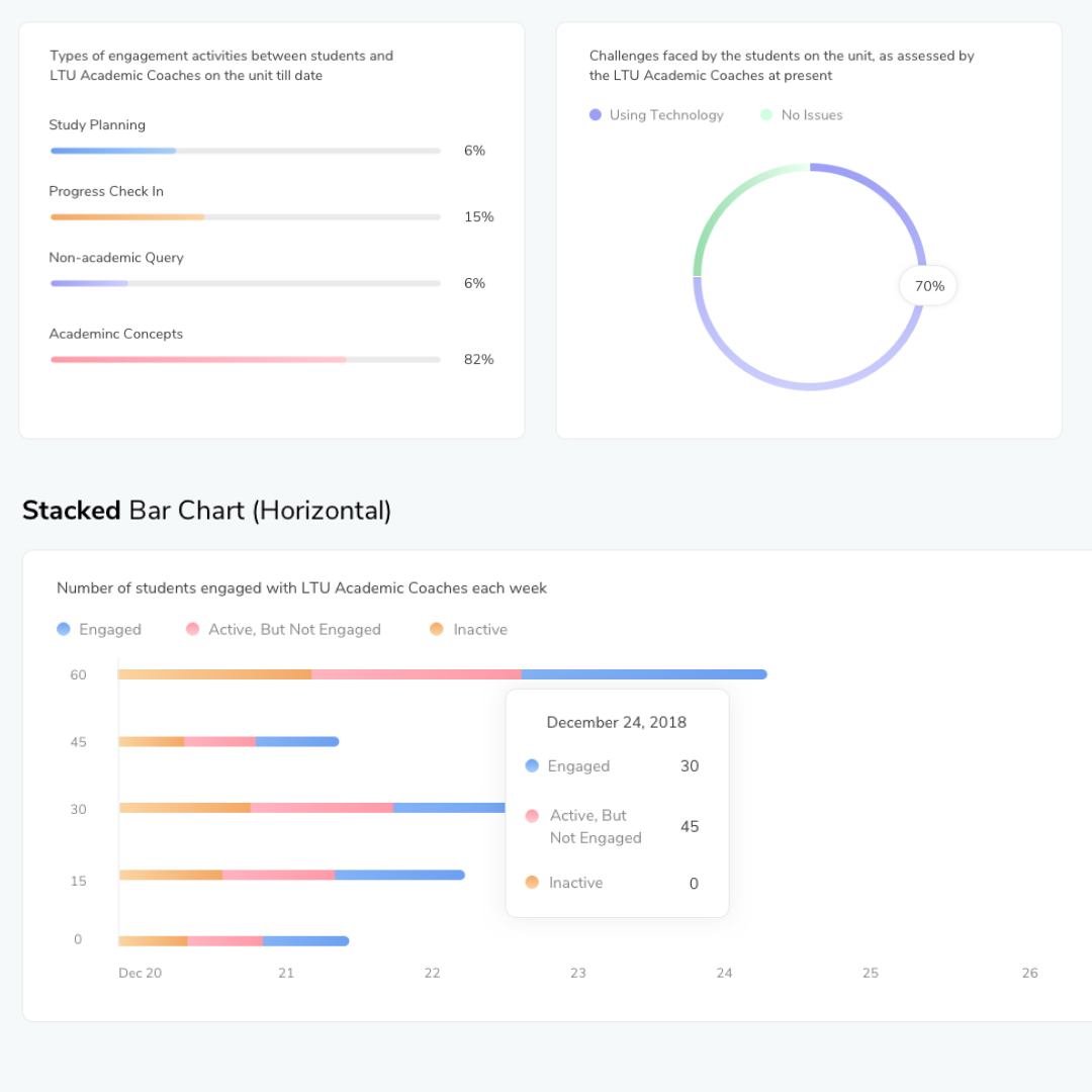
In order to maintain consistency and speed up the development process, the style guide was created. It included all action fields, color palette, type styles, data chart designs.
Before and After
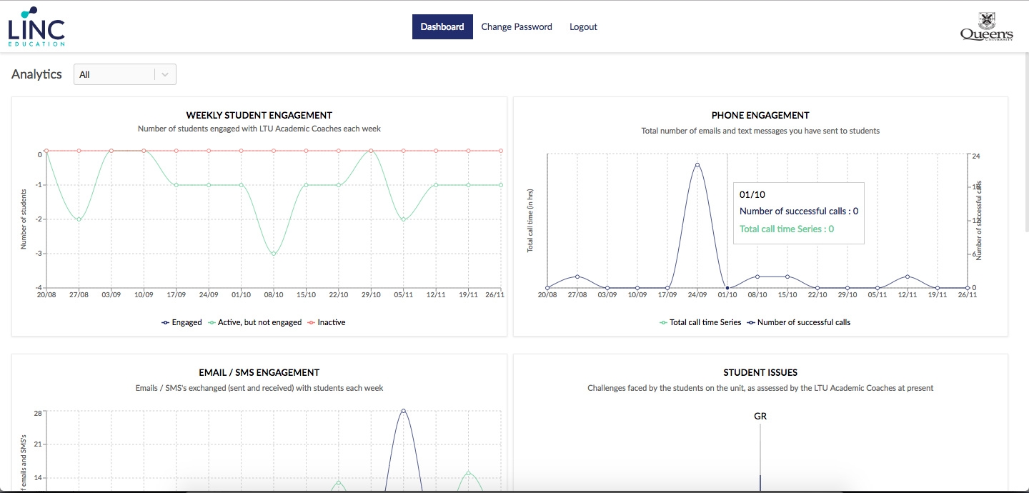

With consistent navigation throughout pages, clear labels, organized structure, the final output is definitely helpful and easy to browse for users. This could keep users efficient to focus on their particular requirements.
Next Steps & Reflection
Next Steps
As possible next steps, I'd do more research and gather more insights to enhance the dashboard with helpful features and data metrics.
Adapting designs to more responsive mediums like an android and iOS app would be ideal to track the real-time performance right from the phone.
Reflection
As much as I loved working on this project, I wish I would have got the chance to do more user research and interview. I was lucky enough to work with a supportive and helpful client. They provided me with useful insights and research which was done from their side.
© Copyrights Umadii 2024
